Printed vs Jacquard vs Embroidered: Which Craft Fits Your Logo and Budget?
Printed, jacquard (woven), and embroidered aren’t “styles”—they’re manufacturing systems with different failure modes. I’ll show you what breaks first, what costs spike, and how to spec your logo so quotes stop drifting.
Budget lies often. When buyers tell me they have a “tight budget,” what they usually mean is they’re trying to buy certainty—predictable unit cost, predictable color, predictable delivery—yet they’re picking a logo craft that bakes in variability (stitch count, weave density, ink chemistry, substrate stretch) and then acting surprised when the final quote moves. And who pays for that surprise?
I’m going to be blunt: most logo artwork is priced like it’s being admired, not manufactured. So we end up with overbuilt embroidery on designs that needed printing, under-specified jacquard on marks that needed embroidery, and “cheap” printed runs that fade because somebody saved $0.03 on chemistry.
If you’re making actual products—not mood boards—this is the decision tree I use.
Table of Contents
The three crafts are really three limit systems
Printed
Printed wins when your logo behaves like an image: gradients, halftones, tiny negative space, or lots of colors (CMYK + spot/PMS). On patches, this is commonly dye-sublimation on polyester (PET, (C10H8O4)n) or UV/pigment printing on a fabric base; on towels, it’s often reactive printing for cotton (cellulose, (C6H10O5)n) or sublimation for microfiber.
Hard truth: printing is “cheap” only if you control the ink set, the fabric, and the wash spec. Ignore one of those and you’ll buy rework.
If you’re working in towels, “full artwork” projects belong on custom printed beach towels, not forced through thread.
Jacquard (woven)
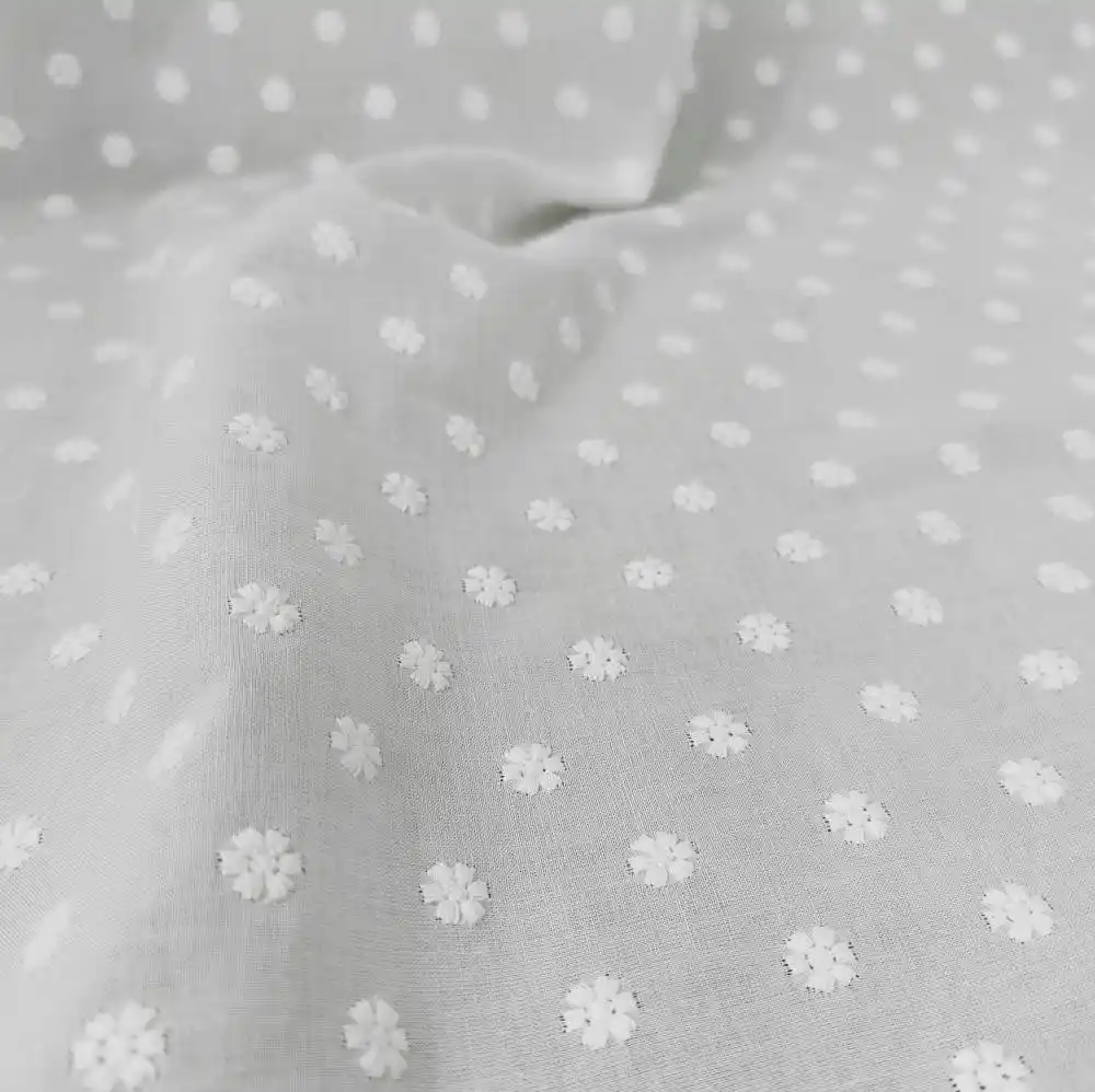
Jacquard is not embroidery. It’s woven structure—thread intersections forming the logo like a tiny textile map. That gives you clean edges and small text without paying embroidery’s stitch-time tax. On labels/patches, “jacquard (woven) patches” are basically high-density woven patches: crisp typography, sharp borders, and better repeatability at volume.
But: jacquard hates photo-real gradients, and it punishes you for too many colors. You’re limited by yarn colors and weave resolution (think 80–120 picks per inch, depending on spec).
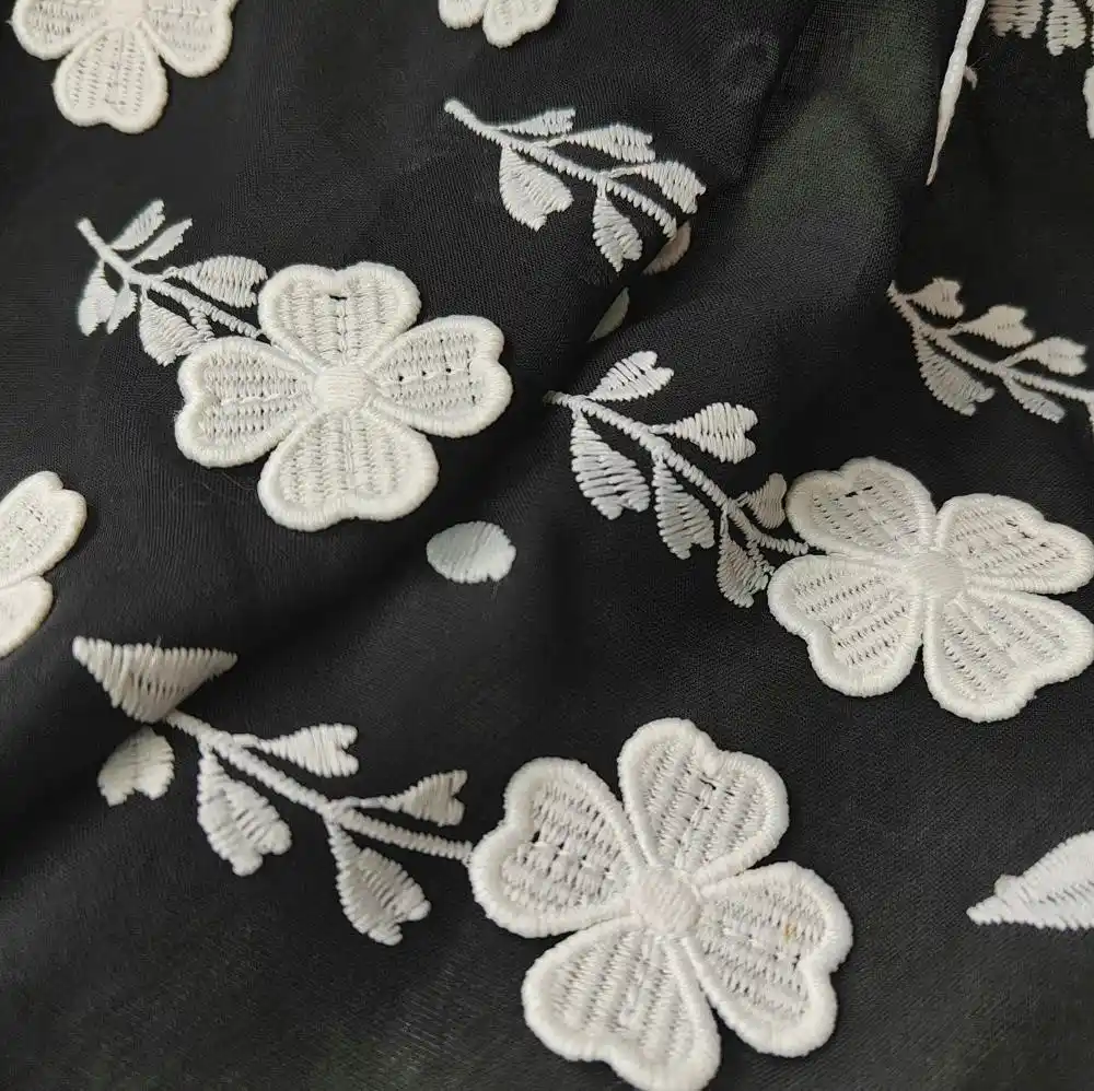
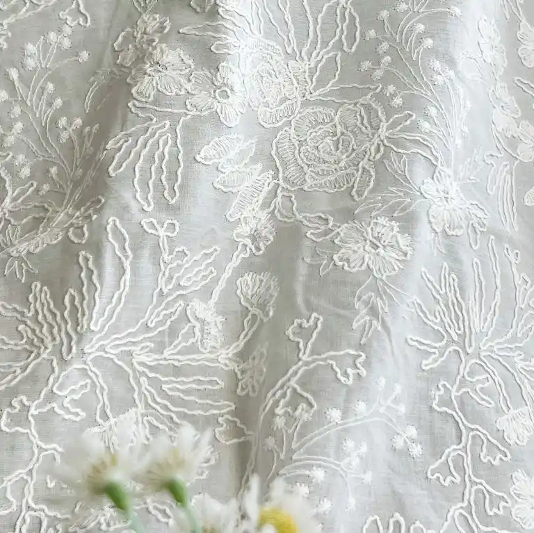
Embroidery is thread + time. You’re buying machine minutes (and the labor around them), not “premium vibes.” On patches, embroidery gives depth and that raised crest look. On towels, it gives a high-end monogram/club identity vibe—until your design gets too detailed and turns into a fuzzy blob.
This is where my unpopular opinion lives: embroidery is overused for logos that have thin strokes, micro text, or tight internal shapes. Your digitizer can “make it work,” sure. You’ll just pay for it, and the edge clarity will still lose to woven.
If you’re doing hospitality or gift-grade towels, point your spec toward custom embroidered beach towels and keep the logo geometry honest (more on that below).
The real cost drivers (the part vendors don’t put in the first email)
Here’s how quotes actually behave in the wild:
Embroidery cost ≈ stitch count × machine rate + finishing. Typical commercial heads run ~700–900 stitches per minute; a dense 30,000-stitch patch can be 40–60 seconds of needle time before trims, color changes, and handling. Multiply by 1,000 units and you’ll see why “embroidered patch cost vs woven” can swing hard when art gets dense.
Woven/jacquard cost ≈ loom setup + weave density + yarn colors. Stable at scale. Less stable at low MOQ.
Printed cost ≈ prepress + ink/dye system + substrate risk. Cheap per unit, expensive when the wrong fabric or wash spec forces a redo.
And yes, labor matters. Embroidery is labor-heavy, and manufacturing labor has been tight; Reuters flagged that the gap between openings and hires in U.S. manufacturing was still about 180,000 (after being over 400,000 in early 2022). That sort of pressure shows up in lead times and “rush fees,” whether a supplier admits it or not. Reuters’ analysis makes the macro point, and you’ll feel it at the micro level when you try to book machine hours in peak season.
A manufacturing-first way to pick the craft
1 Audit your logo like a factory would
I look for three red flags:
Minimum stroke width: if lines are thinner than ~0.3–0.4 mm at final size, embroidery will soften them. Woven or printed will hold them.
Micro text: anything under ~2.5–3.0 mm cap height becomes a gamble in embroidery; woven wins.
Color behavior: gradients and photos want printed. Flat, iconic marks can be woven or embroidered.
2 Decide what you’re optimizing
Pick one primary goal:
Cheapest unit cost at high color count → printed
Sharpest edges for small text → jacquard/woven
Tactile “premium” + depth → embroidery
Trying to optimize all three is how you get the worst of each.
3 Match the craft to how the product is used
Promos are ruthless: the job is “look good on day one.” Retail is harsher: “still look good after wash #20.”
That’s why giveaway programs often live in promotional & corporate gift towels with printing, while resort programs can justify embroidery or jacquard for longevity.
The sports-uniform fiasco is a warning label for logo craft decisions
When MLB uniforms got hammered for quality issues—small lettering, mismatched colors, see-through pants—MLB and Nike publicly acknowledged fixes were needed. Reuters reported the league planned larger lettering and other adjustments after complaints. Reuters coverage lays out the problems bluntly.
Why do I care in a patches-and-labels conversation? Because it’s the same failure mode: spec changes + material decisions + production shortcuts = branding that looks cheaper than the brand. Your logo application is part of product quality, not decoration.
Quick comparison table (patches, labels, and towel branding)
Craft
Detail ceiling
Best for
Weak spot
Typical MOQ behavior
What makes cost jump
Printed
Highest (gradients, tiny shapes)
Photo-like logos, lots of colors, fast promos
Fade/scratch if ink + fabric + wash spec don’t match
Friendly to low MOQ
Color management, ink set, fabric coating, wash tests
Don’t ignore the legal side (logos are not “just art”)
Here’s another hard truth: if you’re applying someone else’s trademark—even “just on patches”—you’re playing with liability. The U.S. Supreme Court’s Abitron v. Hetronic opinion is a reminder that trademark disputes can span cross-border sales and still land hard; the case involved massive damages at trial (about $96 million) before the extraterritorial scope was tightened.
If you’re a brand owner, you want license control. If you’re a manufacturer or distributor, you want paperwork.
Sustainability note (because buyers will ask)
If your program touches recycled polyester, certifications, or restricted substances, plan it early. For towel sourcing, I’d rather see a buyer link sustainability to documentation (OEKO-TEX, GOTS, traceable RPET inputs) than slap a green tagline on a polybag. If that’s your lane, start at sustainable rPET towels and certification-ready sourcing and build the spec from there.
FAQs
What’s the difference between embroidered, woven (jacquard), and printed patches?
An embroidered patch is a logo made by stitching thread into a base fabric, a jacquard (woven) patch is the logo woven as interlaced threads like a tiny textile, and a printed patch is the logo transferred with ink or dye onto the surface, usually then finished with a border and backing. After that definition, the only thing that matters is what your logo needs: edge sharpness (woven), color realism (printed), or raised texture (embroidered).
What’s the best patch type for detailed logos?
A patch is “best for detailed logos” when it can hold thin strokes, small text, and smooth gradients without turning them into blobs; in practice that usually means printed (CMYK or PMS) for photo-like art, woven/jacquard for micro text and clean edges, and embroidery only when the design tolerates thicker lines and raised texture. If you’re seeing fuzzy counters in letters like “A” or “R,” you’ve exceeded embroidery’s comfort zone.
How much do embroidered patches cost vs woven and printed?
Custom logo patch cost is the combined price of setup (digitizing or loom programming), machine time (stitch count or weave density), materials (base fabric, thread, ink, backing), and finishing (merrow border, laser cut, heat-seal), so embroidered patch cost vs woven or printed can swing 2–4× depending on size, coverage, and order quantity. If you want stable pricing, cap stitch count (or swap to woven) and lock size early.
Are woven labels better than embroidered labels?
Woven labels are typically better than embroidered labels when you need tiny fonts, QR-like detail, or sharp linework on garments because the thread grid can resolve finer edges than satin-stitch embroidery, while embroidered labels win when you want a raised, tactile crest and you can afford thicker strokes and higher unit cost. For care labels and small branding tabs, woven usually wins on legibility.
Which is better for a logo: jacquard or embroidered?
Jacquard is better for a logo than embroidery when the brand mark relies on fine typography, thin outlines, or dense fills that would require extreme stitch counts, whereas embroidery is better when the logo needs dimensional pop, a premium hand-feel, and you’re okay simplifying gradients into solid thread colors. My rule: if the logo must be read from 60 cm away, woven; if it must be felt, embroidery.
Conclusion
If you want quotes that stop “mysteriously” changing, send your artwork in vector (AI/PDF/SVG) plus a sized mockup, and tell the supplier which outcome you’re optimizing: lowest unit, sharpest detail, or premium texture. Or skip the back-and-forth and spec all three as options—printed, jacquard, and embroidered—then compare apples to apples on your next run.